Personal project · 2026
Live demoBus View
A live bus map that decides what deserves your attention.
Sydney has around 1,700 buses on the road at once and a constant stream of delay updates. Bus View shows the ones that are going wrong, groups them into incidents a person can act on, and lets you narrow the map by asking in plain English.
Built on Transport for NSW's open real-time and timetable data, in two days, to test an answer I had given out loud.
Where it started
This started as an interview question. I was asked how I would design a live bus map when there is too much information: hundreds of moving buses and alerts every time one runs late. The interviewer showed me AnyTrip, which puts every vehicle in the state on one screen, as an example of the problem done well.
AnyTrip is very good at what it does, and what it does is show everything. That is right for an enthusiast and wrong for someone whose job is to notice what is going wrong. I gave my answer in the room, then spent two days building it to find out whether I was right. Some of it I was; some of it I wasn't.
In the app
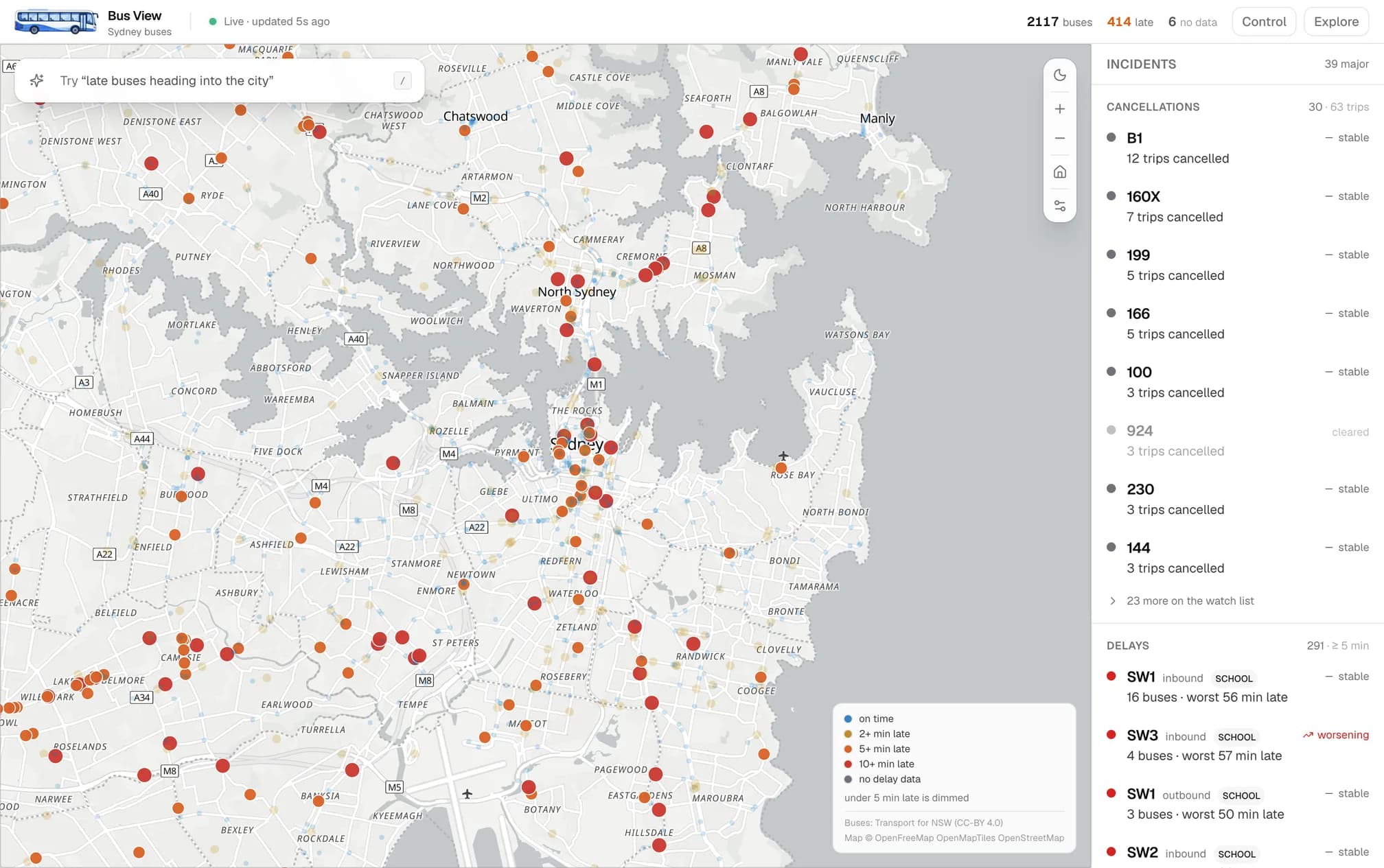
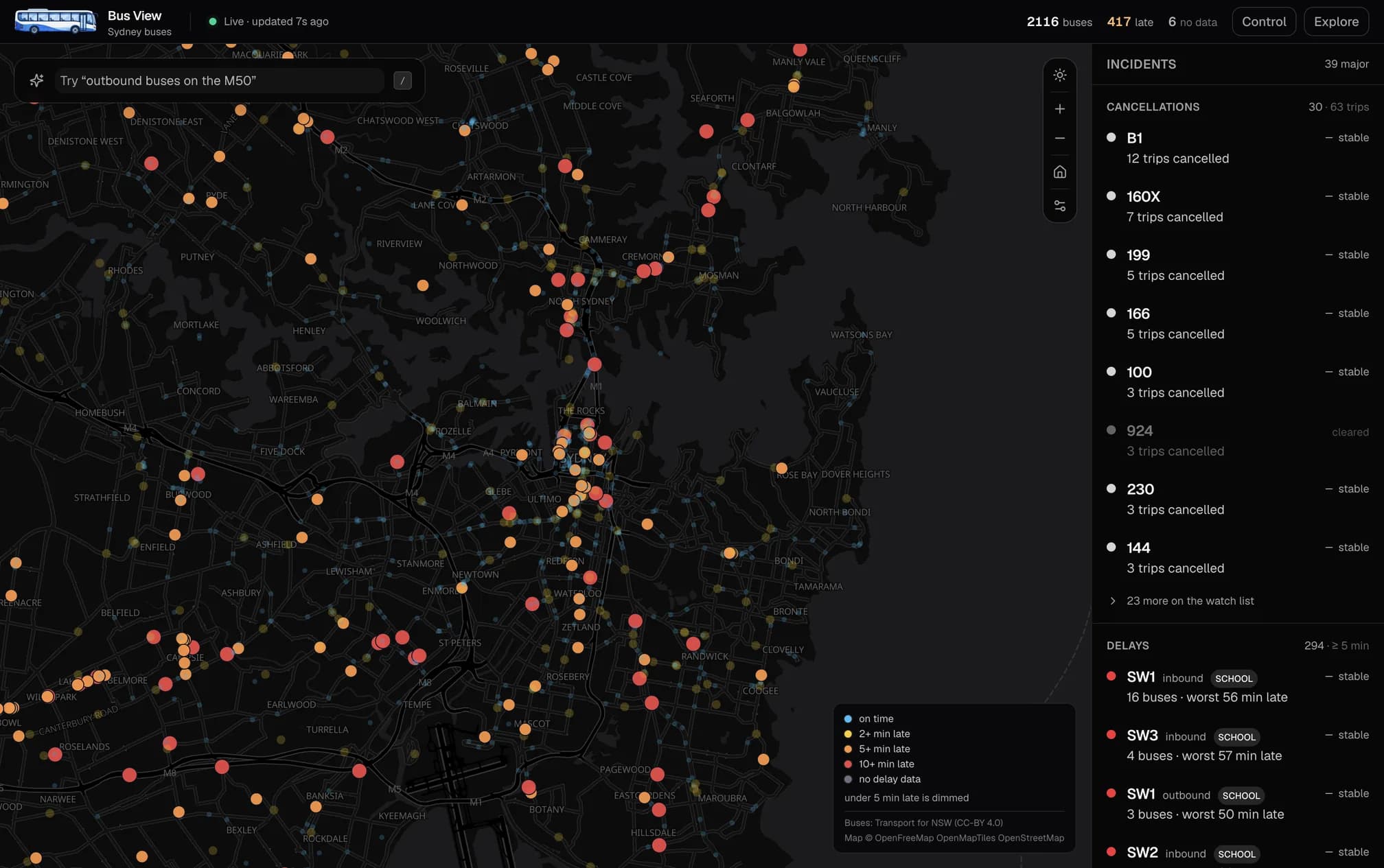
The product model
- Show what's wrong, hide what's fine
- On-time buses fade into the background. Late buses stay bright and grow with how late they are. The map is readable at a glance without touching a control.
- Incidents, not alerts
- Forty late buses on one road are one incident, not forty pings. Late buses are grouped by route and direction, ranked by how bad it is, and split into a short list of big problems and a folded-away watch list.
- Cancellations first
- A cancelled trip has no bus, so a dots-only map can never show it. Bus View lists cancellations as their own class at the top of the panel, because they are the thing a controller has to act on.
- Ask in plain English
- “Late buses going into the city” or “show me bus 3801” becomes a set of visible tags you can remove one by one. The assistant only translates words into a filter; it never applies anything you can't see.
- One map, different starting points
- A controller opens Control mode and sees problems. An enthusiast switches to Explore and sees everything at equal weight. The layers are the same; only the defaults change.
- Saved views that watch for you
- Save a filter as a view of your own routes. Each saved view shows a live count of problems inside it, so a corridor you are not looking at can still tell you something is up.
- “Late” is a setting
- What counts as late is a slider, not a constant. It defaults to five minutes, Transport for NSW's own on-time definition for buses, and every count and colour on the screen follows it.
Following one bus
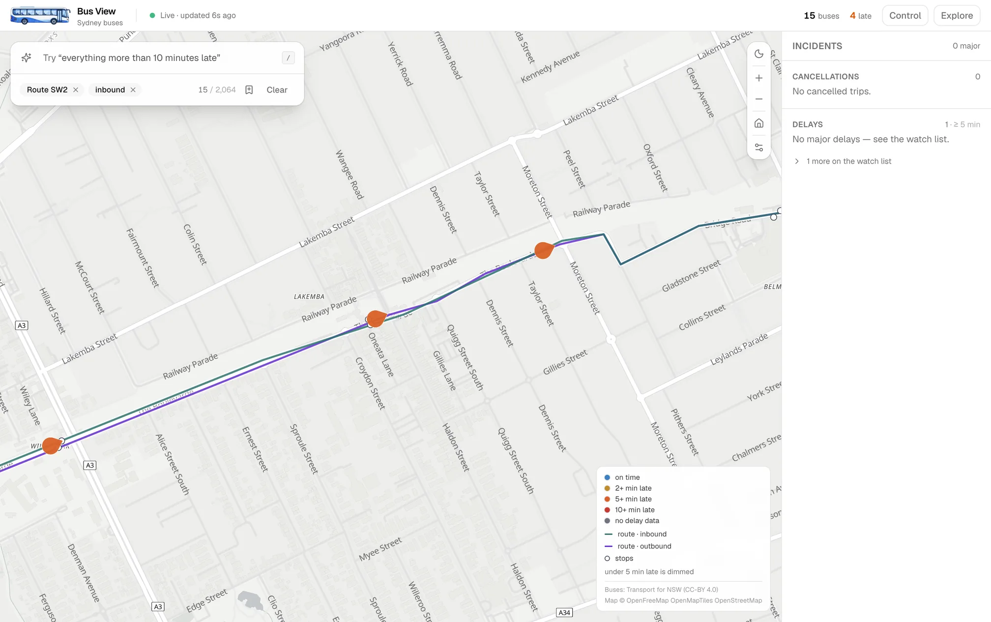
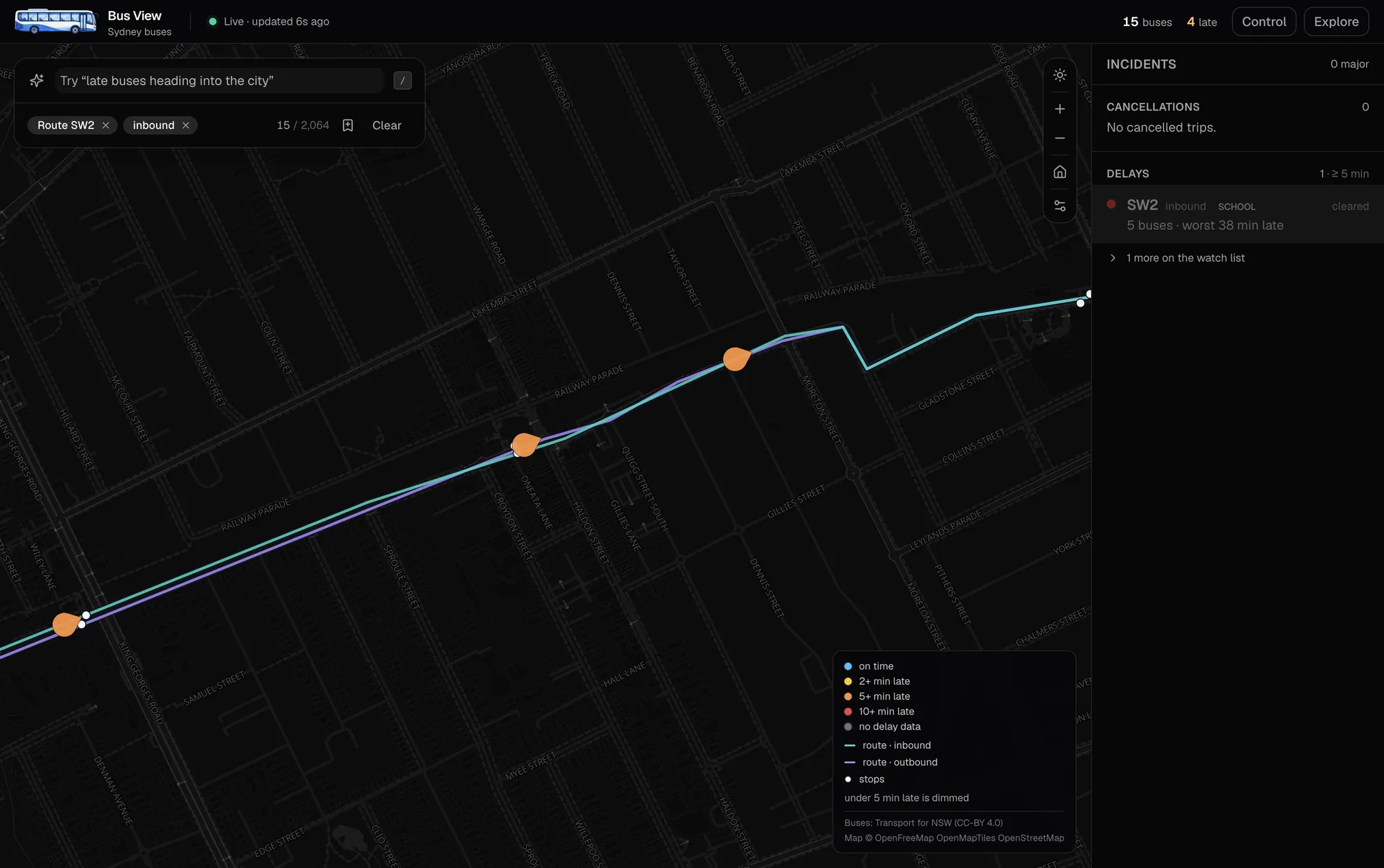
What I got wrong
The point of building it was to check the answer, and the answer changed in three places.
- 01
Clustering buses
In the interview I suggested merging nearby buses into one circle with a number, a standard way to reduce clutter. It is wrong here. A cluster of thirty buses hides exactly what matters: whether two of them are twenty minutes late. And buses move, so clusters would split and merge every few seconds. The goal was never fewer dots. It was the right dots. Fading the fine ones solved the clutter without throwing the information away.
- 02
Trusting the feed for direction
I assumed the live feed would say which way each bus was going. It doesn't: no direction, no destination, for any bus. Worse, the decoder returned zero for the missing field, which quietly read as “outbound”. I built a small index from the static timetable to fill the gap and made every missing value read as unknown instead of zero.
- 03
A two-minute threshold
My first definition of late was two minutes. Across seven hundred routes that produced 377 incidents at two in the afternoon, which nobody can read. Moving to the operator's own five-minute definition, and adding a bar for what counts as a pattern rather than a single bus, turned it into a panel a person can act on.
What the data taught me
On an ordinary weekday afternoon the median Sydney bus is about two minutes late, one in ten is more than eight minutes late, and around a hundred are more than ten. That is a real, readable amount of trouble, and it is invisible on a map that treats every bus the same.
The same feed carried 185 cancelled trips that afternoon, on routes like the 199 and the B1, twenty at a time. No dot ever appears for a cancelled trip, so the map people already use cannot show the single thing a passenger most needs to know.
And the feed says nothing about where a bus is going. Direction and destination had to be rebuilt from the static timetable, which is also where the route lines and stops come from. The real-time data is the easy part; making it mean something is the work.
The engineering follows the product
Most of the decisions came from one rule: nothing on the screen should be a black box. What the assistant did, why a bus is coloured the way it is, and how fresh the data is all have to be visible and checkable.
- 01
The model translates; the code decides
The assistant is a single tool call whose schema is the filter object. Route numbers and fleet numbers are checked against the live data in code, so the model cannot invent a route that isn't running. Anything it produces is shown as tags before it touches the map.
- 02
Vehicles are a data layer, not markers
1,700 buses are one GeoJSON source rendered by MapLibre, styled by data-driven expressions for colour, size and opacity. Positions tween between polls so buses glide rather than jump. At street zoom, buses become teardrops pointing the way they travel, tinted per bus through a signed-distance-field icon.
- 03
The static join lives on the server
Transport for NSW's timetable bundle is reduced once to under four megabytes: trip to direction and headsign, stop to name, route to shape and stops. The server joins it into every vehicle at request time, so the browser never sees the raw feeds.
- 04
Honest freshness
The feed is polled at a rate the user chooses, from five to sixty seconds, with a server cache shorter than the fastest poll and no CDN caching, so “updated 5s ago” means what it says.
Where it goes next
Service alerts from the operator's alerts feed belong in the bus card next to the delay. A commuter mode, “I want to get to Bondi”, is a journey-planning problem and stays out of scope on purpose.
The thresholds and tiers are a first pass. Tuning them properly needs a real controller in the room, which is the conversation this project was built to start.
Notes from the build
Technologies
- Application
- Next.js 16, React 19, TypeScript, Tailwind CSS 4, shadcn/ui, Lucide
- Map
- MapLibre GL, OpenFreeMap basemaps, data-driven styling, SDF icons
- Data
- Transport for NSW GTFS-realtime (vehicle positions, trip updates) and static GTFS, decoded server-side with protobufjs
- Assistant
- OpenAI tool calling (gpt-5.6-luna) with code-side validation of every value
- Hosting
- Vercel
Bus View is built on a simple idea: when there is too much to look at, the interface should do the looking first, and show its work.